Friday 21 April 2017

Evaluation of ideas

Back cover
The first draft of my album back cover was the least successful panel. The weakness are that the background colour is too dark, therefore doesn't match the lighter tone of the other panels. This dull colour also isn't eye-catching to the audience, however it works well to make the white text clear and stand out. This could be improved by either making the background colour brighter, or removing the grey strips at the sides, because they draw focus from the photos. The font works well, because its coherent with the font on the front cover. However the album title at the top is too small and unclear. I also need to change the album title to something that relates to the mirror and reflection motifs, such as 'mirrored worlds' The colour of the text works well because it stands out against the grey background, and works with the monotone style of the album. However i could add some red to the text, to connect it to the text on the front cover, and make it look more eye-catching to the audience. To make the photos look more abstract i could try them with a filter on, from Photoshop. Finally i also need to add a copyright symbol to this cover in the corner. This cover conforms the indie genre, because they usually feature a band member, and from the album covers i have looked at, the layout of the text and images is similar.  This cover contrasts the other panels because in the others the subject's face is never shown, constructing representations that she is lost and has no identity, which also creates a sense of enigma. However i am shown in the back cover, to create the representation she is confident and powerful, reinforced by the direct mode of address. The initial design and layout is successful, but could be made far better with the improvements i have suggested. 


This is the draft for my album front cover. This was challenging to create however looks very successful. The deconstructed reflection works well because it is surrealist, and creates a sense of enigma. The subject is represented as enigmatic and lost in reality; these representations it constructs could relate to the audience. The font cover looks good and needs little improvement. The only weakness is that the red text decreases the quality and doesn't work with the monotone style. Therefore i could change it to black or white, and place it somewhere it will be clear to read and stand out. This cover links to the indie genre because it features a band member and looks abstract because i have deconstructed the image, to alter the perspective of reality. The monotone colours also work well because they make the image look emotive and bright, so it will stand out to the audience and look intriguing.


The side panels for the album cover also work well as they are cohesive with the rest of the album, because i have used the same photo as the front cover. It is also simple and understates, to give a minimalist style, and not to distract from the main panels. They are a development from the front cover, because i have added colour to them in the photos in the reflections. This looks good because it makes the covers more vibrant and exciting. It also connotes meanings, as the colourful photos suggest she is fantasising about escaping reality, into a saturated, lively world. These would appeal to the audience because of their eye-catching aesthetic, and they could relate to the theme of escapism.I could improve these panels further by adding text to them. In order to link these panels to the song i could place lines from the lyrics of the song 'bloodstream' to the corners of the panels. I could also make this text red to link to the 'bloodstream' song title.

The magazine advert is successful because it is bright, clear and cohesive to the other productions. The image draws the audience to it, because the leading lines bring your eyes to the titles. Also the text is emphasised by the bold red colour, and the font of the headings is the same for the album cover, therefore creates a link between them. The image relates to the album cover because it is in black and white, to make the text stand to against it. Also it follows the surrealist visual style because the image has been altered, by repeating it, to create a stylised reality and create metaphors for escapism and reality being repetitive. The text is good because it is relevant and would appeal to the audience because it isn't overly cluttered, and is informative. The text includes a magazine review and bold titles for the album and band, which will persuade the audience to buy the album. It links to the genre because indie productions usually use an abstract image, to look original and intriguing. However it also breaks conventions because magazine adverts usually feature a band member, to make the advert recognisable. I haven't included a person in this image, because the photo is supposed to shot from the point of view of the person, and it shows someone's perspective on reality. This could be improved by making the red lines on the road more clear and adding more of them. Also i could add a pack shot of the album cover, so that the audience can clearly see the links between them.

Thursday 20 April 2017

Development of ideas

Album- back cover
This was the first draft for my back cover. To improve on it I should incorperate some red in the writing, and remove the grey strips either side. I could also change the album title at the top to Bloodstream or something else.

Album- front cover
The first draft of the front cover looks good because the photo is crips, and the monotone colours work well, and create tones and shadows. However the red headings could be changed to either black or white, to match the monotone style, and the red makes it look low quality. I could also change the album title, so that it relates to all the reflection motifs, to make it more coherent.


album- front cover
The initial look of my idea for my album cover. I constructed it by removing the image from the mirror, and reconstructing it, using a different image. I improved this first image by flipping the image of me inside the mirror, because the way it should reflect isn't correct there. I also made the colour inside the mirror lighter, because the grey made it look too dark and made the subject inside the mirror lack focus, as it needed a brighter background. 


For the sides of the album cover, the first drafts were successful and need little improvement. They were simple to create because i could use the image from the font cover and just replace the image from the inside of the mirror for a different photograph. However these panels need to include some text, and look more busy, therefore i will add song lyrics, from the song Bloodstream, to the corners of these panels. 
The first draft for the magazine advert also worked well as the image is eye-catching and constructs surrealist metaphors. Also there is relevant text, however the layout doesn't make it look overcrowded. To improve the first draft I could include a pack shot of the album cover, and make the red lines on the road more clear. 

Location and Mise en scene

Intertextual references

Wednesday 19 April 2017

Narrative Structure

Narrative structure 

Narrative techniques are used to structure my music video. The music video will be purely narrative, illustrating the lyrics of the song and creating representations and events that relate to the audience. We plan to include lots of different character types, to create diverse representations, which could relate to the audience. The costumes and mise en scene will construct different character types for each actor, such as the main character, mean girls, gangster, geek. For example the preppy character will be dressed in formal, preppy clothes, and have a friendly persona. The character types engage with the audience and structure the narrative, because their behaviour can illustrate the emotions of the song. 
The narrative structure will have a clear equilibrium, disequilibrium then a reconstructed equilibrium. This method will allow the audience to visualise the song, because the equilibrium can change with the dynamics in the song, and changes in intensity. This builds a story line, which is dramatic and entertaining, making it more memorable to the audience. To reinforce this narrative structure, we will include a crescendo in the music video, which builds the narrative to a climatic moment. 

Within the character types there will be binary opposites, to create more broad representations and to bring conflicts between characters. Enigma is a narrative technique that will engage the audience and will enhance the plot and shape the characters. The main character is enigmatic because her face is never seen in the video. This will be constructed through the camerawork, as the video will be shot from her point of view, therefore she is never seen and remains a mystery. 

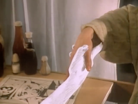
The music video has an impressionist narrative as it will narrate the lyrics of the song, through the use of mise en scene and acting. The video will be set at a house party, therefore the scenes of drinking can relate to the lyrics. The song talks about addiction and heartbreak, it references alcohol and drug abuse. We intend to reference the lyric 'get into my bloodstream' throughout the video. For example through shots of people binge drinking, or shots of a couple in an argument, to portray emotional heartbreak and addiction.

The video will use a reverse in the narrative structure, to rebuild the equilibrium, and reverse the story line back to the beginning, therefore undoing the negative events and dramas. There will be no dialogue or script, because they are not typically used in music videos. However there will be an introduction, before the song starts, but we have chosen not to have dialogue because the silence builds up the suspense for the soundtrack, and keeps the audience interested. Ellipsis can be used, to speed up time, through the use of jump cuts. This matches the pace of cuts to the beat of the music, keeping the audience entertained.

The music video will have a multi-stranded narrative, where different storylines will be happening to different characters at the same time. This happens as the main character moves through the house party, from room to room, witnessing different situations, such as a couple arguing. It almost has a circular narrative, because all the scenes will be reversed back to the beginning, however it won't finish on the shot it started on, as it will be a new shot of the main character leaving the house.
This structure will bring the storyline back to an equilibrium, and the ending will be clear to the audience. The reverse technique and repeating of shots, to create a nostalgia and deconstruct the equilibrium, make up a non-linear narrative. The narrative is mainly in chronological order at the beginning, the reaches the climax of the song and starts to jump back and forth, in no time order. This is done to create flashbacks of shots which signify various dramas and meanings, such as shots of blood.

Andrew Goodwin states that there are three different categories for music videos, where they can connect back to the song itself. The first is illustration, where the concept of the video is based around the meaning of the song's lyrics. Amplification is the way music videos use both performance and narrative, whilst signifying connotations of the song's meanings. The third is disjuncture, where the music video is irrelevant to the content of the song and genre conventions, and make little sense, therefore creates abstract visuals.
Our video uses illustration, because it is based around a narrative, giving an impression of what the lyrics are about, so that the audience can visualise the song.

Another music video that uses the same illustration narrative is A-Ha 'take on me'. They use characters and plots to illustrate the lyrics, based on a romantic fantasy narrative. This works well because it creates a visual for the song, so the audience can understand the meanings and emotions the band were trying to portray, and represent them in the characters in their video. They use both live action and animation, to construct their fantasy theme and build a clear narrative.


Sunday 9 April 2017

Preliminary ideas


 This is one of my initial ideas for my magazine advert. My intention is to capture an urban cityscape, in order to connote messages over chaotic reality. It is an over the shoulder, long shot, to capture the person's perspective and construct the representation that she isolated, as they are separated and looking down at everyone. The high angle shot reinforces this and also represents the subject's high level of power or status over the world. The subject is on the rule of thirds, to draw the audience's eye towards them, and it relates to both the album cover and music video as the main character's face is never shown. The road also influences where the audience are drawn to, as the road creates leading lines. This looks interesting as the road disappears off into the distance, connoting the person is out of reach of reality and modern life. However this could be composed better so that the leading lines lead to one of the text headings, as this would draw attention to the album title. This idea could also be improved by using a visual style, as i would like to use surrealism, to create an abstract image. This image would be black and white, to make it look more emotive and the subject more isolated, then the text in red to make it stand out and relate to the song 'Bloodstream'. I think that the shot of the road from a bridge works well because they are metaphorical locations. Both the road and bridge connote escapism and freedom, traveling to different paths. Therefore it does create surrealist messages of escaping reality into dream worlds.


This is another version of my magazine advert idea. I have made improvements on the first idea by changing the composition of the leading lines, so that on the advert the headings will be placed in the centre, bringing attention to them. Also i have repeated the image, to create a sense of surrealism. It conforms this visual style as it deconstructs the image to look abstract, therefore also deconstructing reality. It would be shot in dark lighting, set on a street, so that there are bright spot lights from the street lights, highlighting the subject. The subject still creates a sense of enigma by having their back to the camera, walking down the road, escaping reality. To add colour i will airbrush the photo on Photoshop and make the lines on the road red, to draw attention to the centre and the leading lines. This image creates a narrative through the enigmatic character and the theme of escapism. I like this design as mirroring the image relates to the album title 'Mirrored worlds' and the surrealist visual style. I also like the composition and the long shot, as it is suitable for a magazine advert; not too boring or overcrowded. However the location of the bridge, giving a view of the urban landscape works better because the camera angle would make it look more extensive and infinite. The weakness of this idea is that it isn't clear what genre it belongs to, therefore it needs to conform to the indie genre, as magazine adverts usually feature close ups of band members, to make it recognisable. 


This is the main idea for my album cover, as it responds to both the minimalist and surrealist visual style and looks original. The idea is to have someone looking into a mirror, then the reflection is altered and shows the back of them. This was inspired by surrealist photography where someone's reflection is deconstructed then reconstructed to change the perspective of them. A lot of surrealist photography is also in black and white, to focus on tone and the portrayal of the subject. Therefore the front cover of the album will be in black and white. This also makes it minimalist as it makes it more simple and plain,  so that colours don't cause a distraction from the main focus and theme. There is a lot of negative space, with only the subject and prop in the centre, to draw the audiences' eye to it, which is another feature of minimalism. I will construct this idea through Photoshop, and use this technology to insert the altered image onto the reflection. The headings could go across the top, in a simple font to establish the minimalist style, yet they would stand out as the layout isn't crowded. The use of a character in the image creates a narrative, creating a sense of enigma and possibly sympathy for her. This can also make the image relatable to the audience because they could relate to the subject's loss of identity and belonging, or maybe the desire to escape normal reality. 


This album cover works best for its composition, because each feature is placed on the horizontal rule of thirds, making it eye catching. From researching surrealism, eyes are a key visual, used to show someone's point of view but manipulate it into something unusual. Therefore i have done a close up of an eye, which will be altered in photoshop, to create an image, portraying the persons vision. To make it cohesive to the magazine advert i could use the same image or setting, then merge it with the eye. This creates the same connotations and representations as the magazine advert, as the road is a metaphor for escapism and represents people in modern life wanting to escape the repetitive nature of everyday reality. The magazine advert is also shot in a way that shows someone's viewpoint, which is the same idea as this image. It also relates to the title 'Mirrored worlds' because it shows a reflection. The composition is typical of an album cover because the headings are placed above and below the image. It also looks minimalist therefore it gives the audience a clear understanding of what to notice. This design also includes leading lines, which lead to the centre of the cover, attracting the audience to this cover in a store, because it immediately draws your focus. However I prefer the other album cover design because it is more original and includes a person that could be a band member. This cover is less clear of the genre because i haven't seen any other indie covers similar to this, and there is limited mise en scene to reference conventions of the indie genre.