Arctic Monkeys
Arctic monkeys are an indie- rock band, formed in Sheffield in 2002. They have released 5 successful albums and performed massive, worldwide gigs including Glastonbury. They have also won 7 Brit awards.
The album cover and magazine advert for their latest album 'AM' conforms, as well as challenges conventions of the indie genre. It is a successful cover for an album because of its minimalist visual style, making it simple yet signify metaphors. To attract their audience to their new album, they posted the album artwork on Twitter, with the release date. They have a loyal online audience, therefore with this intriguing, striking cover it draws people to the album.
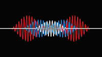
The image on the album cover is of a pulse-line, which relates to the sound of their music because many of the songs on this album feature a strong, beating baseline. Also the heartbeat theme relates to the lyrics as they are all about love. This cohesion of themes makes reference to Goodwin's theory. Goodwin said that music videos demonstrate genre characteristics, which is also demonstrated in album covers as the AM cover conforms the rock genre by illustrating the strong baseline, key to rock music, and the dark colours are a convention of rock. Also the record label tend to include close ups of the artist and a unique visual style. To meet the demands of production, the arctic monkeys magazine advert includes a photo of the frontman of the band, Alex Turner performing live. This makes the advert a success because it showcases the bands talent, and makes it recognisable to the audience that it's for this band. Finally the use of the heartbeat and baseline responds to goodwill's idea that there is a relationship between lyrics, music and visuals, as there is a coherent visual, creating metaphors relating to the lyrics and the tone of music.
The Arctic Monkeys have also successfully created a brand identity for their band, through their productions. The music video for their single 'Do i wanna know' from their AM album has the same visual as the album cover. The video is an animation of a sound wave, beating in synchronisation with the music and baseline. It starts simple, with a white line on a black background, then as the dynamic of the song moves forward and the chapters change, there are new elements brought in. Colour is added, to connote the development of the song and up beat tones. Then it changes from just the sound waves, as they are interrupted by animations, creating a narrative and representations, relating to the lyrics of the song. For example the recurring visuals of women, relate to the romance theme of the song. It also references Mulvey's male gaze theory, that women are represented from a male perspective, to appeal to them. There is also a reference to the surrealist visual style, as the music video and album cover are abstract and unusual.


 |
| 'AM' album cover |
 |
| magazine adverts |
The image on the album cover is of a pulse-line, which relates to the sound of their music because many of the songs on this album feature a strong, beating baseline. Also the heartbeat theme relates to the lyrics as they are all about love. This cohesion of themes makes reference to Goodwin's theory. Goodwin said that music videos demonstrate genre characteristics, which is also demonstrated in album covers as the AM cover conforms the rock genre by illustrating the strong baseline, key to rock music, and the dark colours are a convention of rock. Also the record label tend to include close ups of the artist and a unique visual style. To meet the demands of production, the arctic monkeys magazine advert includes a photo of the frontman of the band, Alex Turner performing live. This makes the advert a success because it showcases the bands talent, and makes it recognisable to the audience that it's for this band. Finally the use of the heartbeat and baseline responds to goodwill's idea that there is a relationship between lyrics, music and visuals, as there is a coherent visual, creating metaphors relating to the lyrics and the tone of music.
The Arctic Monkeys have also successfully created a brand identity for their band, through their productions. The music video for their single 'Do i wanna know' from their AM album has the same visual as the album cover. The video is an animation of a sound wave, beating in synchronisation with the music and baseline. It starts simple, with a white line on a black background, then as the dynamic of the song moves forward and the chapters change, there are new elements brought in. Colour is added, to connote the development of the song and up beat tones. Then it changes from just the sound waves, as they are interrupted by animations, creating a narrative and representations, relating to the lyrics of the song. For example the recurring visuals of women, relate to the romance theme of the song. It also references Mulvey's male gaze theory, that women are represented from a male perspective, to appeal to them. There is also a reference to the surrealist visual style, as the music video and album cover are abstract and unusual.


I like this album cover and magazine advert because the album cover is simple, yet not a typical cover, therefore it stands out and is identifiable to their unique visual style throughout their productions. The magazine advert also works well because the image of them performing live promotes their album tour, and encourages people to buy their music because it proves that they are a success, performing to massive crowds at popular festivals. Also the font on the magazine advert reinforces their brand identity, as this is the font they always use for their band name, making it identifiable to their audience. The bold, creative font is composed on the top centre of the advert, and has a large scale so that it stands out immediately. Also the colours are successful as they relate to the black and white album cover, and the white font stands out against the dark background and is easy to read.
Looking at these print production examples is very useful as I plan to use similar styles, formats and colours in my own work. From this I have learned how you can make metaphorical and visual links between all the productions, to build up the brand identity.


No comments:
Post a Comment